Shop
Packed With Style
From gourds and leaves to blister packs and sleek aluminium cases, packaging has evolved from the purely practical to an art form in both the aesthetic and commercially scientific senses. From the beautiful to the crass and crummy, the packaging says it all before we open the box.
June 24, 2018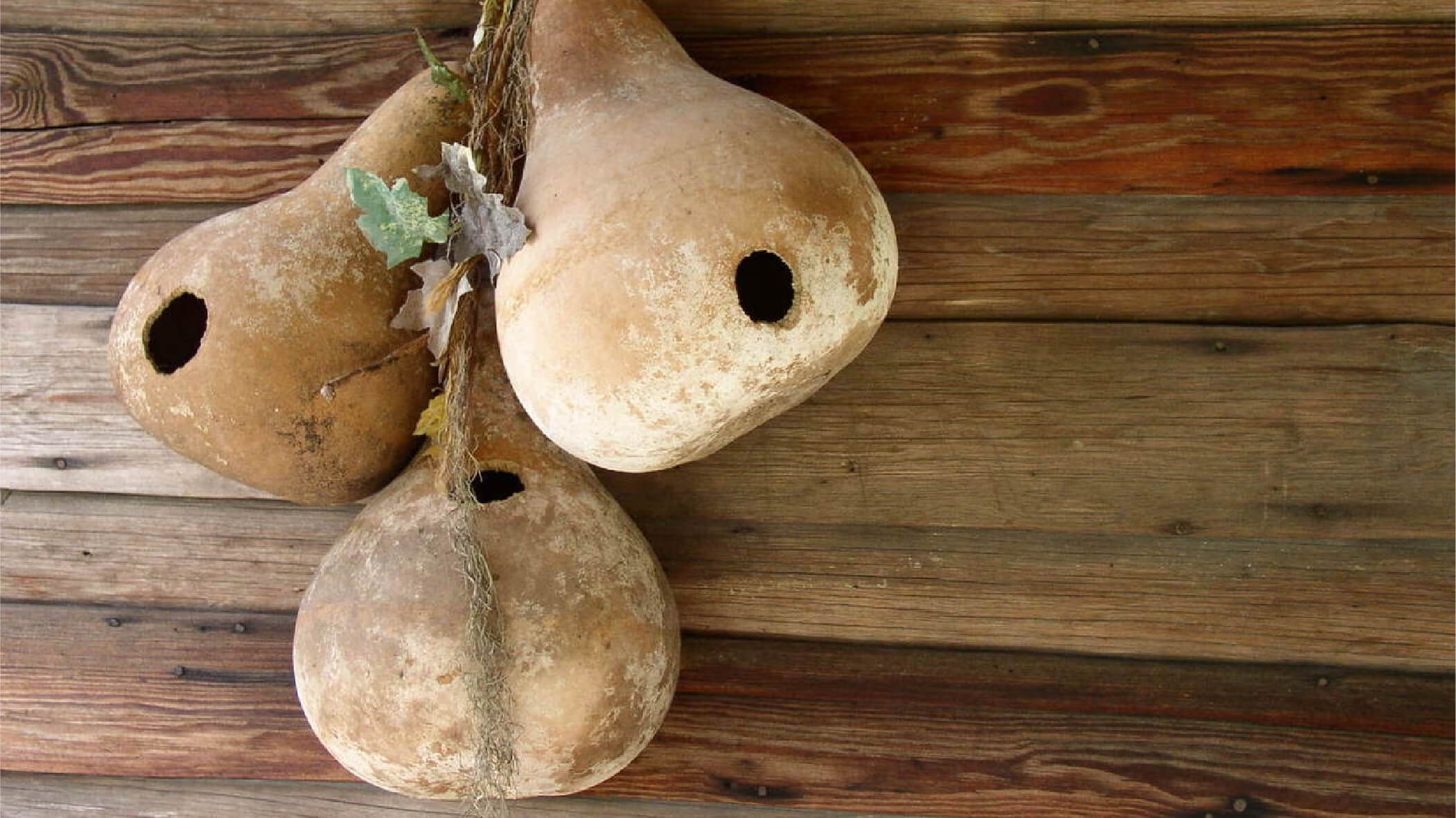
Pacific Island Living
June 24, 2018Packaging – while it’s becoming increasingly difficult to actually penetrate, sometimes I think a hand grenade is the only way to get into some of those blister packs made of kevlar – it’s also a highly refined graphic art form.
You’re holding an example right now, yep this magazine is a ‘package’ inasmuch as it has been designed to give the reader some hint as to what to expect when opened. In this case the weight of the cover, the binding, the quality of the stock on which it is printed and the layout are all designed to hint at a certain quality of content. In this instance a quality that is hopefully a few steps up from a tabloid newspaper or a weekly gossip mag. In our business it’s designed for a particular demographic which in turn attracts a different quality of advertiser, one who is seeking what we hope is a discerning traveller in search of ‘lifestyle’ information that hints at the upmarket consumer.

But no matter what product you’re buying the same applies to the presentation of the goods, cheap crude graphics on low grade materials suggests budget, low value goods, whether they are headphones, watches or cans of soup. The first thing you see on a shelf is the package and you know instinctively where it’s designed to sit in the cachet rankings.
There is both science and artistic virtuosity applied to the packaging design business and brands are dependent on those designs being distinctive and in some cases durable enough to last for decades. The Coca Cola logo which has changed very little over its life-span, was first registered as a design in 1893, has to be a prime example of a lasting design applied to an equally distinctive package in the shape of the iconic contoured bottle which was first used in 1916 after the owners called for tenders to design a “bottle so distinct that you would recognise if by feel in the dark or lying broken on the ground”. Mission accomplished!
Way back when our goods were grown in the back garden or the field next door, foodstuffs were transported, traded or sold in very plain wrapping – think a gourd or a leaf or bark. Much later when these same goods were obliged to compete on the shelves of shops, more commercially attractive wrapping was used to distinguish one gourd from another and with the advent of new packing materials such as glass, metal, plastic and cardboard it became necessary to tart up the design a bit so that we could readily recognise our favourite brand of soup or cigarettes or computer. Imagine your apple MacBook Pro tied up in a piece of bark and you get some sense of how far this form of commerce has come. Indeed Apple, apart from being maybe the world’s richest company is also the market leader when it comes to distinctive and beautiful packaging, those restrained white boxes with simple typography and tactile materials that have you salivating at the prospect of simply unwrapping your next digital masterpiece. And the box doesn’t deceive, what’s inside is even better when it comes to packaging a motherboard and a lot of printed circuits, that metal case is a joy to hold and behold – it’s all in the packaging.


And that’s equally true of cigarettes but in reverse. It was only a few years ago the tobacco industry were dreading the arrival of ‘plain’ packaging which ultimately turned out to be far from plain unless plain scary is your version of plain. Big tobacco imagined a much more restrained version of plain packing when it was first mooted but still believed that it would be the death of smoking, as it is smoking still survives (maybe better than its customers) albeit with graphic pictures of human offal instead of elegant silver and gold and subtle colours. In this case the packaging is designed to do the exact opposite of almost all other containers – the message is ‘don’t buy’!
That said, I think the country that probably had more smokers than any other at one point, is also the home of packaging as an art form. Japan is the home of artistic presentation on a grand scale. A simple bag of sweets bought from an itinerant vendor in the underground entrance to a train station will take five minutes to purchase because the wrapping ritual is a form of origami even in that humble surrounding. And when you do get on the Shinkansen the box of cakes or biscuits you buy is an even more elaborate work of packaging art. A joy!•
© 2024 Pacific Island Living Magazine all Rights Reserved
Website by Power Marketing